You may accuse me of cynicism if I note that the experience of watching televisually adept political rallies held in athletic stadiums makes me think of the late Leni Riefenstahl.
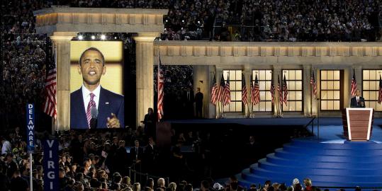
I might confirm your characterization by asking whether you noticed that Barack Obama wore a red tie for his big speech last night.

The magic podium that came up through a trap door on the stage in front of the faux-Corinthian columns from which the 21st century Apollo emerged and then went back down when it was time for the onstage family fest customary at such public rituals was also red, or at least it looked that way on the CNN HD broadcast I was watching.
The candidate's wife and children, when they emerged for their big photo op, were also wearing red, as was the Vice President's wife.

This apparently deliberate signaling of a mood of revolutionary change is interesting to me as a longtime observer of the media semiotics of the use of color to depict American political parties. In the recent past, the media convention has been to associate red with the Republicans and blue with the Democrats. As you may be well aware if you have ever been castigated at a dinner party for "living in a red state," or heard one of your neighbors rationalize "we live in a blue dot in a red state."

Having long felt that much of the purported difference between America's dominant political parties is, viewed in the context of other polities with greater political diversity, a bit of a tribal "red team/blue team" delusion, I have found the adoption of this contemporary cultural parlance particularly annoying. You may say, that's convenient for me as someone who lives in a "blue dot in a red state." (To which I might point out, my color is brown.)
These particular color associations with the two parties are a relatively recent development. The default associations used to be the opposite.
While it is probably silly to think that the networks intentionally assigned the colors, the fact that they have stuck with such memetic power suggests they capture some deeper emotional/tribal associations in the age of the GWOT. Surely the gurus of brand marketing would tell you that color associations are among the most important tools in the semiotic toolkit of mass manipulation of public opinion. Why else would they have fought so hard some years back to ensure that corporations can obtain federally registered trademarks for the use of particular colors in connection with particular types of goods and services. Consider, for example, that one of the primary trademarks of the Discover Card is the "orange glow," and that United Parcel Service has morphed its brand image to simply "Brown." And in politics, there is of course the longstanding example of "the Greens."
For an excellent discussion of this phenomenon, consider this 2004 article by Phil Patton in the AIGA Journal of Design:
One Fate, Two Fates, Red States, Blue States
One fate, two fates, red states, blue states—have red and blue replaced red white and blue as our national colors?
We refer to the red states and the blue states so regularly now that the association seems long established. But only the 2000 presidential election established the linkage of blue with Democrats and red with Republicans. In earlier years, the television networks and magazine maps had reversed the association. In 1984 rival networks associated red with Democrats and blue with Republicans. The Reagan sweep of that year was called "Lake Reagan" in one context.
In many ways the link goes against tradition. Red has long stood for the left and one has to suspect that the first usage of it to represent Republicans was inspired by an effort to seem non prejudicial.
The end of the cold war made red baiting and pinko artifacts of a time past; the critical mark of the change may have come when the old red baiter, Richard Nixon, visited “Red” China.
On the other hand, blue was the color of the Union army uniforms, by contrast to gray, and has a historical link to the party of Lincoln. But in the Revolutionary war blue was the color of the Continental army uniform: red that of the British, of course.
Wrapping the candidate in the flag is the hoariest cliché of bumper stickers and posters. Post 9/11, with every politician in the land sporting a flag lapel pin, even clothing seemed to aspire to flagdom: red tie, white shirt, blue suit became common.

The colors of the flag are more than ever the staples of campaign graphics. (And despite Nader in 2000, who today could imagine that Jimmy Carter in 1976 adopted green, a hue that these days is as likely to evoke Islam as environmentalism?) But this year’s campaign graphics seem to have lost the traditional white of the trio. John Kerry’s stickers show a hopeful sea of Democratic blue, with flailing strip/stripes of red and a single tiny white star. They recall the Bank of America’s recent abbreviated flag logo.

It is as if in all the flag waving of the last few years the white in the red, white and blue had vanished. The blue-red opposition has come to stand for a wider sense of political and cultural polarization—between cultures, incomes and classes. Has white vanished out of fear of suggesting surrender? Does it mean all hope of truce or compromise has vanished?

I have to think that it is not a coincidence that the traditional association of red with the party to the left expired sometime after the death of the Soviet Union. Which also happened in parallel with the Reagan-era association of the G.O.P. with a more aggressive military posture, and, in the age of the Iraq War, with an openly scarlet military adventurism. The idea of popular revolution being dead, the party of blood on the streets becomes the party of Mordor-like mechanized military might. Shock and awe is red, not blue.
As are rednecks, especially as seen from certain urban quarters.
(Can it be any accident that the W.-era Republican red tie fetish recalls the historic wearing of red bandanas by Scottish Presbyterians to represent their having signed manifestos of religious identity in their own blood, a practice which is the true origin of the term "redneck"?)
And blue, of course, is the color of dipassionate professorial cool, of Tory reserve, of the Establishment. The color of Yale University, National Public Radio, and those cryptically named pharmaceuticals that keep you from getting in a bad mood.
Phil Patton suggests the real message (and cause for alarm, literally) comes from the spectral dipole:
Red and blue joins red and green—stop and go—and even Stendhal’s red and black as a basic binary.
Each color has its associations. Blue is cool and dispassionate, red heated. But it is neither the red or blue alone where the meaning lies, it is in the combination.
It is a pairing with overtones of alarm. Light bars atop police cars strobe warnings in red and blue. Not long ago activists protesting gang violence in Irvington, New Jersey marched with mock coffins, alternately covered with red and blue representing the Bloods and Crips gangs.
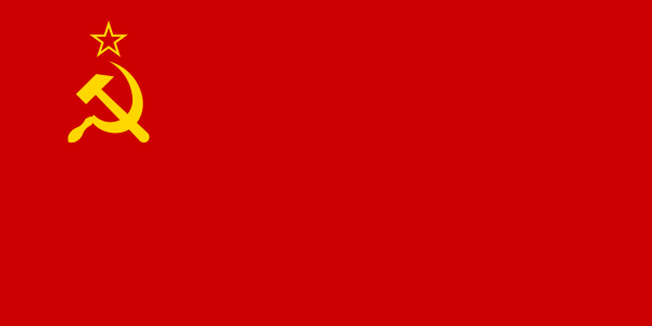
Is our division into red and blue a new national emblem in itself, like Swedish blue and yellow? Usually it takes three colors to make a national color scheme: French tricolore, German black red and yellow, Jamaican green yellow black. Red and blue meet white in the Russian flag. Red and blue were the colors of Paris joined with the white of the King of France in the tricolor.
Any melding of blue and red suggests an impossible purple—the color of royalty, rich as the vain dream of national union hoped for by nation builders who bring shabby deposed kings back to conflicted nations—an early scenario for Afghanistan. But purple has also occasionally been used to indicate “toss up” states on this year’s electoral map: the overtones of bruise are appropriate.
At best, red and blue might inspire a contemplative Rothko glow, a study of a wider and more profound opposition. The pairing was seen differently by the great blues singer Robert Johnson, who in his song “Love in Vain” considered a departing rail car and the loss it meant, rolling out of the station “with two lights on behind. The blue light was my blues and the red light was my mind.”

My own suggestion is that, as a revolutionary act of independent thinking (and given that you can't watch television without being reminded that you have a patriotic duty to get a new one before analog transmissions from the ether go the way of the vacuum tube), each American make habit of manipulating the color balance on her television set to thoroughly subvert the color schemes of the political semioticians who want to control your mind when you walk into the ballot box in November. Flush out all the red and all the blue, and see what happens.

Wikipedia on colors, their associations and etymologies:
Red
Blue
Red states and blue states.
1 comment:
I've been amused by the red/blue switch ever since I noticed it during the 2004 election cycle. Baffling how this could've happened without anyone really noticing at the time.
What's really amazed me is how the Obama logo design subtly coopts the famed "Morning in America" theme of Reagan's masterful 1980 campaign. Another data point for your red-tie-wearing Obama file...
Post a Comment